For any organisation, a recognisable brand identity is an important part of its presence. The International Adventure Racing Association is proud to unveil their new logo and the inspiration behind the design and brand colours. The Association’s artwork was developed by Designer and Brand Strategist Fletcher Hamel, an adventure racer from Utah, USA.
IARA’s brief to Hamel was for a clean, simple design that would be easily recognisable and readable with elements related to the sport.
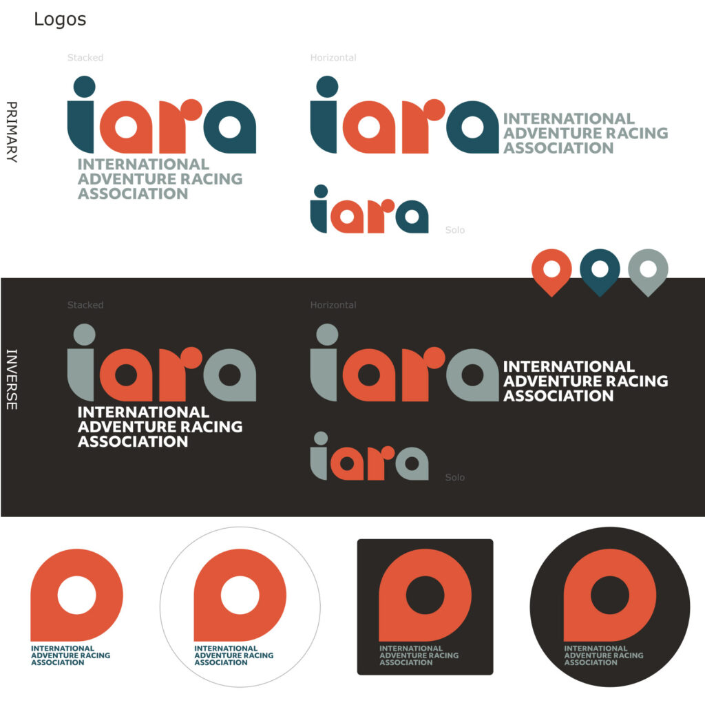
“The logo itself is a nod to the people of the sport in the I and R, and the defining discipline of adventure racing, navigation, in the two As,” Hamel explains.
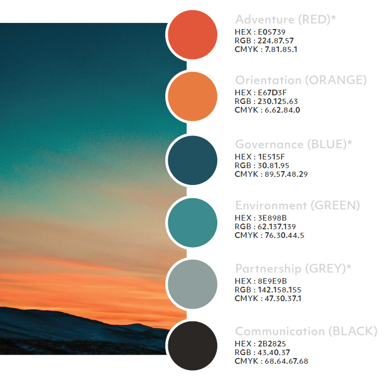
For the brand colours, Hamel drew inspiration from the outdoors and the colours between day and night.
“Adventure Racing is a non-stop sport where teams keep going throughout the day and night. IARA’s brand colours represent sunset, sunrise, day and night,” he says.
Hamel’s adventure racing experiences guide and inspire his work. Themes of navigation, adventure, exploration and nature abound in his content, portfolio and inspiration.
The tagline of his company, The Handrail reads “We get lost brands found”. Like an orienteering handrail feature that guides, supports and gives navigators direction, in his work Hamel too helps his clients to stay on course with the right strategies and design elements to support their businesses and brands.
“We are delighted with the logo and brand elements that Fletcher created for us,” says Lisa de Speville, IARA’s General Administrator and part of the organisation’s Media working group.
“The logo and colours identify with the sport of Adventure Racing and are clean, clear and easily recognisable as befits an international association”.
The International Adventure Racing Association has an online presence through their website – internationaladventureracing.org – and social media profiles @internationaladventureracing
